One primary action
The Donate button uses RMHC’s expressive shape and heart icon. Its red fill gives the main action priority, while an outlined secondary action stays available without competing for attention.
บริจาคเรียนรู้เพิ่มเติม
RMHC Thailand · Selected design-system work
I organised RMHC’s Thai and English interface into shared rules for colour, type, grids and reusable components. The same rules carry from individual controls into complete pages.
Thai-first typography, brand colour roles and one clear primary action.
Foundations
I translated RMHC’s global brand guidance into digital roles and responsive rules so pages stay consistent.
Red marks the primary action. Soft White is the page ground; Lavender and Aqua distinguish content sections.
Thai has its own type scale and line height. The Figma file specifies complementary English display styles for a consistent hierarchy.
A 12-column desktop grid and a four-column mobile grid give the same content a clear layout at each size.
Components
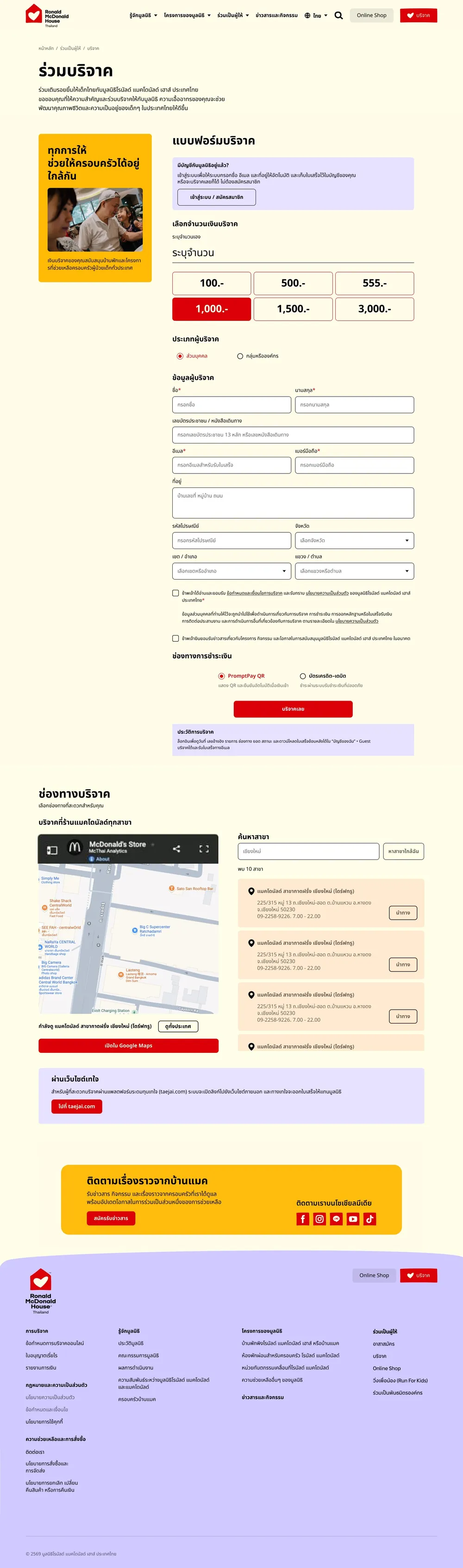
These examples show how the library supports the work people actually do: choosing an action, completing a form and reading a content section.
The Donate button uses RMHC’s expressive shape and heart icon. Its red fill gives the main action priority, while an outlined secondary action stays available without competing for attention.
Fields retain a consistent shape. The error state adds a clear message rather than relying on border colour alone.
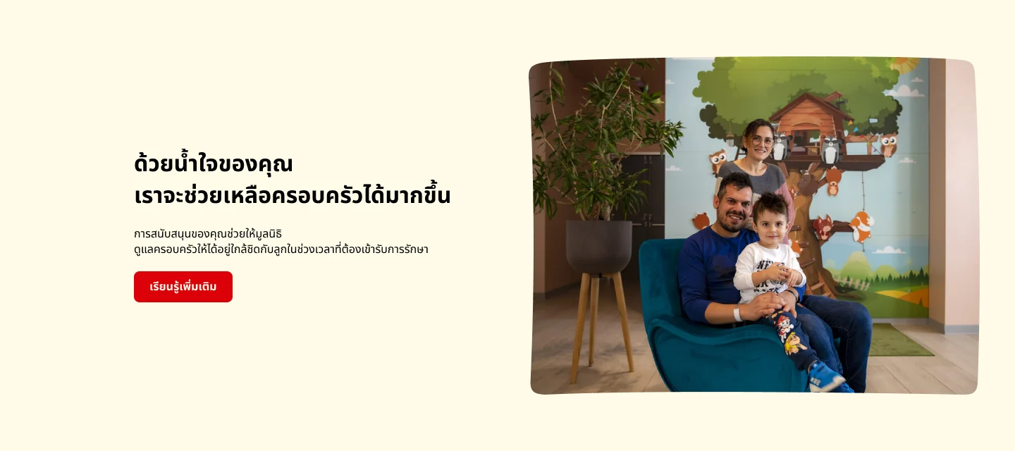
The feature module pairs Thai copy with a shaped photograph and one clear action. Its layout can be reused without redesigning the same section on every page.
Visual language
Branded illustrations support the content; functional icons keep navigation and controls familiar.
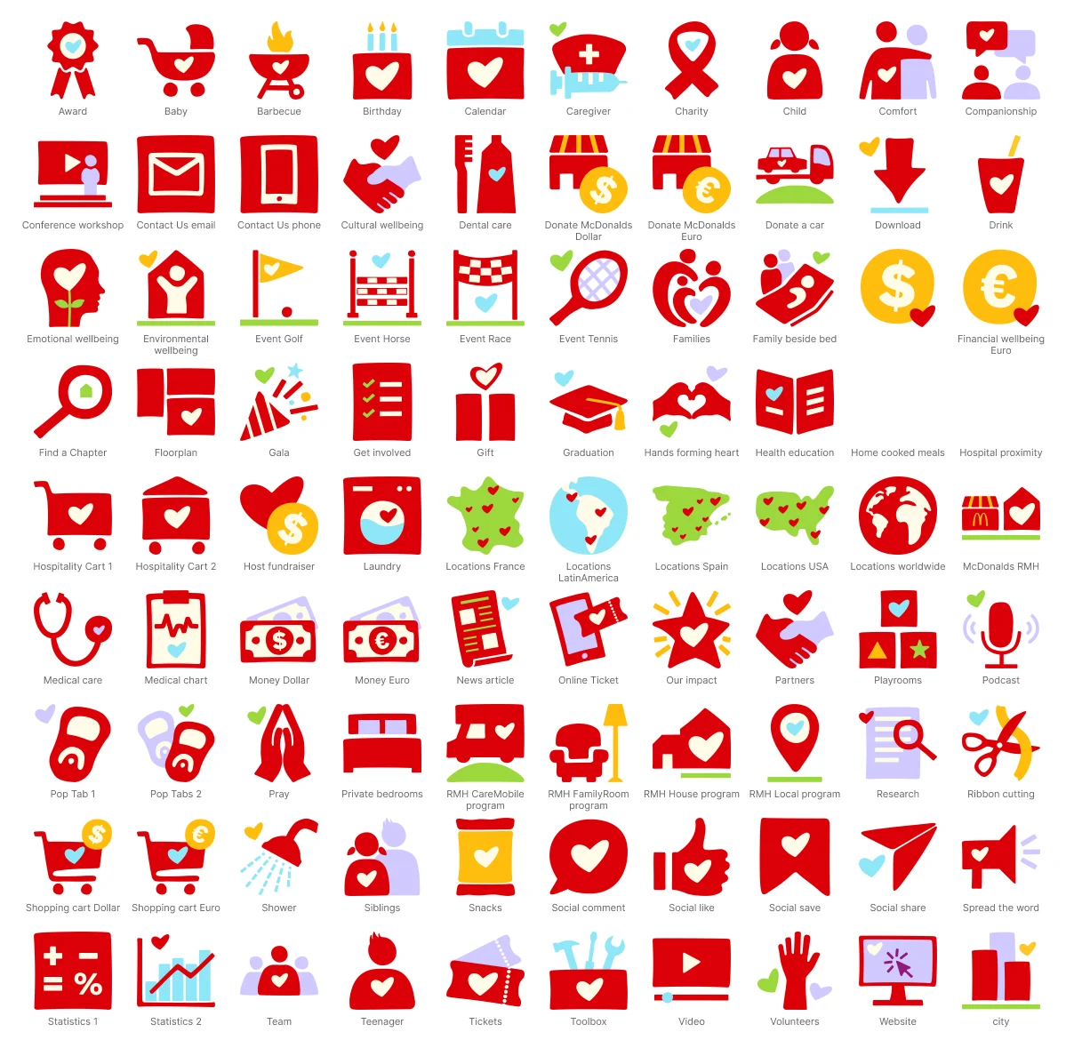
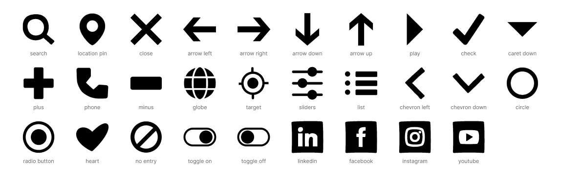
RMHC’s visual language uses expressive hearts and gently irregular rectangles in photo crops, content cards and the Donate button.
In context
Here are two examples from the RMHC interface. Shared type, colour roles, spacing and navigation connect the pages even though each journey asks visitors to do something different.